Aegis Living
Aegis Living is recognized for creating senior-care environments where families feel understood, supported, and cared for. Yet online, that story wasn’t coming through. Their website held valuable information, but its structure and tone made the journey feel overwhelming rather than reassuring.
The redesign aimed to change that—reshaping the experience into a guided, warm, and human digital space that helps families explore locations, compare care levels, and feel the essence of Aegis long before they visit in person.
Role
Lead UI/UX Designer
Client
Aegis Living — 2023
Bringing warmth, clarity, and trust.
Process overview
Aegis Living sought a clearer, more premium digital experience for families exploring care options. I led the redesign’s direction—streamlining the site’s structure, defining hierarchy, and crafting an elevated visual system. Partnering with UX, content, and development teams, I designed the full end-to-end experience to deliver a more intuitive, accessible, and human-centered platform.

Structuring a Clearer User Journey
Working closely with the UX team, we uncovered a key insight: families valued Aegis Living’s depth of information, but the experience made it hard to understand their options with confidence. Using those findings, we reshaped the site’s structure, introducing a clearer information architecture, refined content hierarchy, and simplified user flows to reduce cognitive load and guide families more naturally through their decision-making.
With the UX foundations in place, I led the visual direction of the redesign. I created a warmer, more human-centered aesthetic through a softer palette, more generous spacing, and improved typography.
The goal was to bring clarity, calm, and a sense of premium care to every page, ensuring the digital experience felt as welcoming as the communities themselves.

Designing the Building Blocks of the Experience
To ensure the site was welcoming and usable for all families, we reviewed accessibility across key templates—refining contrast, spacing, typography, and interaction states. This helped create an experience that felt more inclusive and easier to navigate, regardless of digital familiarity or visual needs.
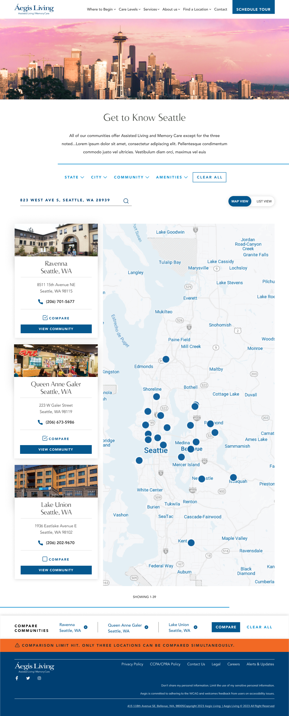
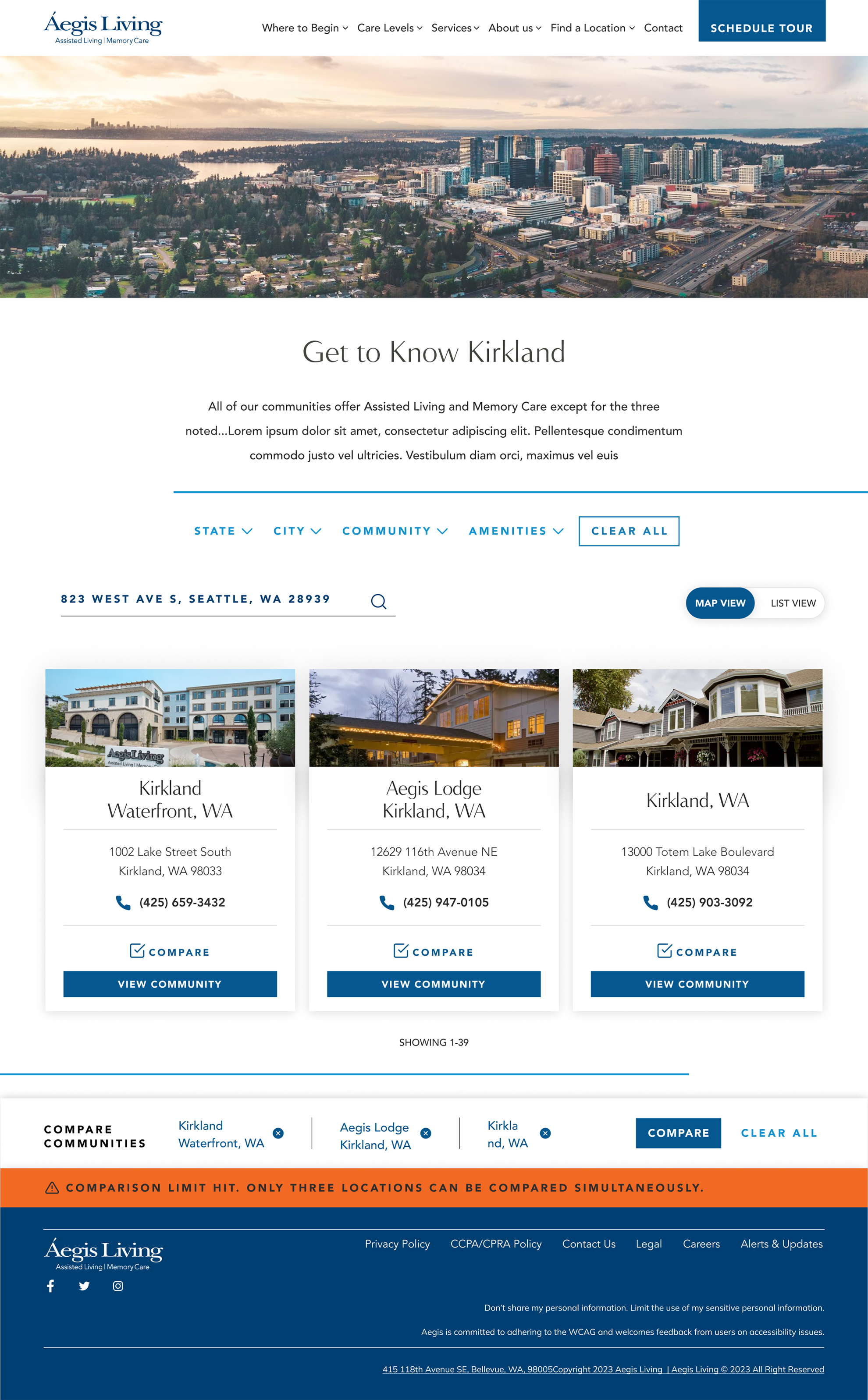
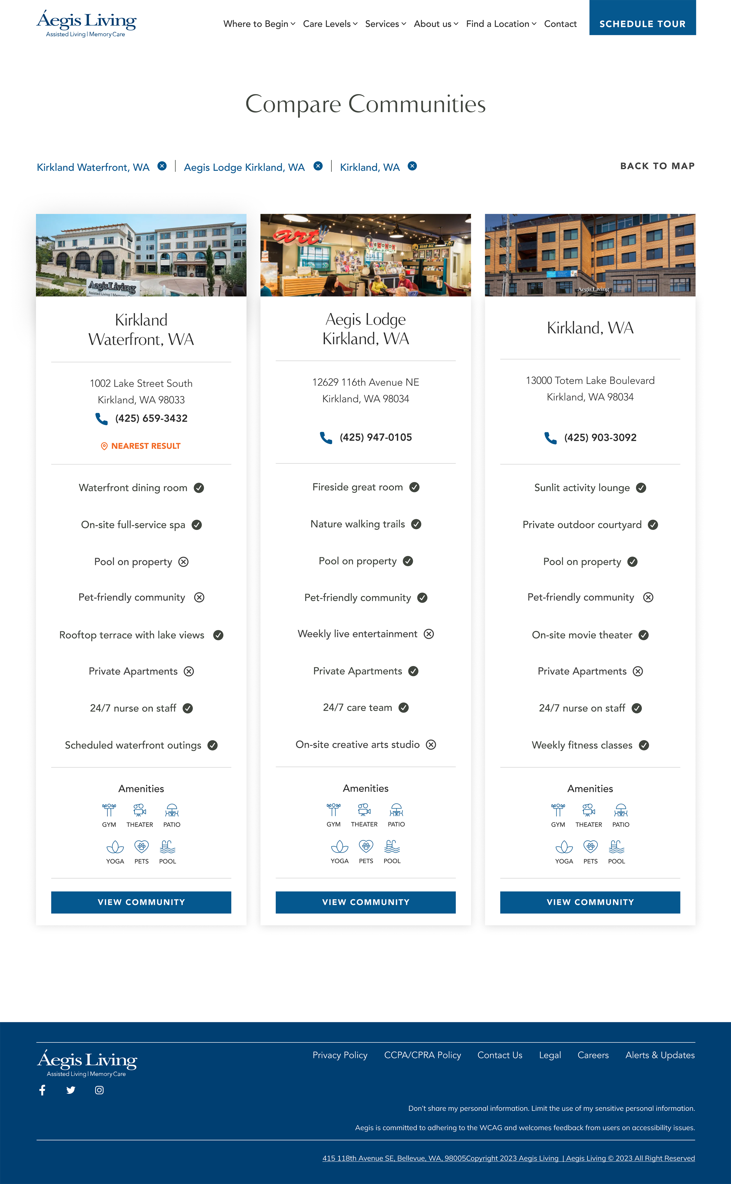
From there, I designed a modular system of components and templates that could scale across 40+ community pages—amenity grids, comparison
modules, hero layouts, room cards, and care-level sections. These building blocks gave the team flexibility while keeping the experience consistent, elevated, and aligned with the new visual direction.
Throughout the project, I participated in design reviews and internal validations, refining layouts and hierarchy based on feedback. The result was a clearer, more accessible, and more human-centered experience that finally reflects the level of care Aegis communities are known for.
Solutions & Impact
The redesign simplified the entire experience—clearer navigation, stronger content hierarchy, and a visual system that finally matched the premium nature of Aegis communities. The new component library made it easier to maintain consistency across 40+ locations, while improved accessibility ensured the site was welcoming to a wider range of users.
These changes led to increased engagement, more intuitive exploration of care options, and a smoother decision-making process for families. The website now communicates the clarity, warmth, and quality that define Aegis Living.